Last week I set out to spiffy up my substack and upgrade my character portraits instead of writing, it increases the overall experience of the page, so I was very excited about it.
But now comes the time for decisions because I will need to do the process a whole 18 times, and probably more very soon.
Oiii decisions, decisions. The bane of the creatives' life.
But thankfully, we do have a very strong starting point with the original sketches.
What are the objectives?
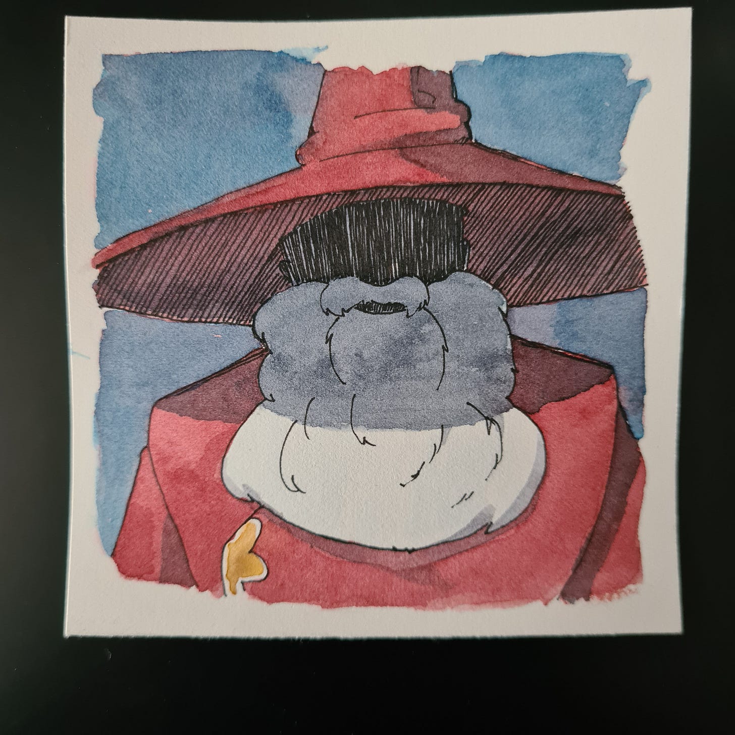
I want to do a watercolour painting since I have been practising for this, for the books I want to use Bombay ink (monochrome) but the process is very much the same and I think colours suit my publication better.
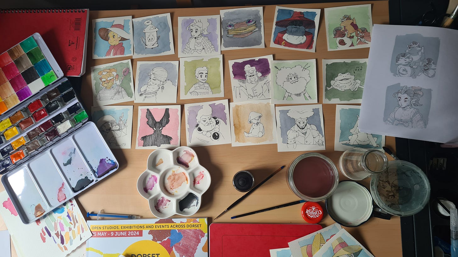
So off we go and get some 200gsm paper, take the dust off of the light box and draw 18 portraits in ink. I must say, I really love the grittiness and texture of these characters drawn with ink!
Then we cut them all into 9cmx9cm squares, and this is when I realized just how much work doing something 18 times is. They look amazing at this point, my little Rolodex of weird and fantastical people.
Let’s do some colour studies now. This was a brilliant thing to do because I got to do a quick video and asked others to chime in. It brings other people in to become part of the process, and it is a very easy ask, choose A, B or C. Happy days!
The results of the poll were very unambiguous.
A - 11 Votes
B - 48 Votes
C - 12 Votes
Here are some of the comments from the Poll
- On Substack“Option B for me - I love the watercolor tones. But I think any of them would be amazing!”
- On Substack“Im a minimalist, i enjoyed option A!”
jr_arts94 - On Instagram
“As a artist i say B for the background n C for the colors on the character, it merges incredibly”
Like I said, the sense of community is very satisfying, it’s not even about validation, just feeling seen is a huge boost to creative motivation.
So all that is left now is to paint them all right? Right.
Except. I have yet to test one thing, after having started the painting process I realized I haven’t tested how I am going to digitalize these.
And then the sky turned grey.
This is where things started to change. I am not the most proficient of watercolour painters, so the process is slow, with a little blotch here and some bleed there. Some add character and others can be corrected digitally.
Then how do you digitize it? A quick search to see the pros and cons of scanning vs photography, I cannot invest in either a good enough scanner or the lights and camera necessary for a good photo setup, so we look in my pocket for what is available, and my phone is the next best thing.
Any lights that I used, washed out the colour, and I don’t know if it was the post-processing from the phone, but it has a strange sharpness. The real paintings have a very satisfying softness to them and the colours are a lot stronger and vibrant.
I don’t think it’s terrible or anything, but the truth is, it doesn’t look as good as the real thing, or as what I can do digitally. I can throw it in my painting software and correct it, but then it’s just a digital painting with extra steps.
It all felt like a huge time sink with no real practical solution, and now it all lives on my drawing table as an altar to lost potential.
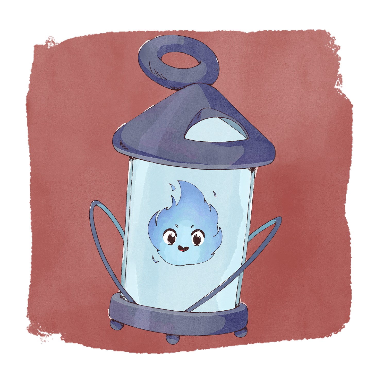
But was it a waste of time? Absolutely not, I actually ended up with a very solid experience of what these portraits look like in watercolours, and it helped me to fine tune my digital process to get the same look and feel. I still want to dive back into solving my problems with digitizing, but I think I made justice to my characters as I wanted to present them to you here on this publication.
It looks amazing, and I’m very proud to share it with you!
I’ll be finishing the rest of them in the coming week!
To you, from the home of magic.
Marco D Blanco.


Ahhhh so fun! Mago reminds me of Luffy with his coloration, my most favorite One Piece character of all time!
Question: How do you think Mago and Luffy would interact on an adventure where they accidently meet each other!
I think Luffy would think Mago's tail is super cool, and Mago would probably (from my brief observation of reading through) wpuld probably try experimenting or playing with him!
All in all, as a fellow illustrator and artist among other things, that wants to bring worlds to life, thank you for your hardwork and dedication to the process! I love it here 😉💖
Your art are so cozy 😊