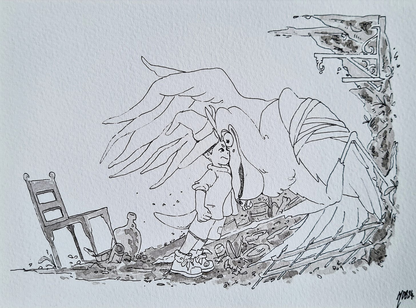
This is it! All the work I’ve put in so far amounts to this one single picture.
If you’re starting a project, there are thousands of small decisions that you need to make! For with each one of them there is a giant standing at your shoulder shouting in your ear:
”Are you sure that’s the right decision??”
Are people going to like this character? Maybe it would be better if you paint him differently! You’re planning to do hundred of illustrations, are you sure that’s the right paper? Or the right ink??
And so far the answer is always: just make a decision, it’s never too late to change it later. But you have to commit to some things right?
Style
A question that holds far too much weight.
What style should I make this in?
For me it was simple, whatever style makes you feel good! Whatever feels natural and effortless.
The question I actually wanted to answer for myself was actually:
Do I make something familiar or so original it’s weird?
My natural tendency is to gravitate to a more eastern animation style. Currently, a couple of people have pointed out how it is familiar to Ghibli Studios and that’s not a crazy statement since I am studying them carefully, but my starting point for inspiration was actually closer to Akira Toriyama’s original Dragon Ball series from 1986.
What a treasure trove of fearlessness and originality this series is! A generation defining amount of gutsiness. That is the mountain peak I dream of climbing.
As I mentioned, I am also studying the works of Hayao Miyazaki, but maybe in a non traditional way, I’m not interested in copying his style, I want to know why him and the studio make their decisions. And I feel I’m slowly getting closer.
I’ve been appreciating some of the core philosophies behind their works, and it has nothing to do with how to draw the eyes or how to paint a tree! I feel like most people who emulate them just distil their works down to those simple stylistic choices. The worlds their characters inhabit stem from their culture, society and religion, things that would be hard to convey in a western body of work. And they are also restricted by the medium of choice, animation, on which they thrive. I’m sure there will be opportunities to delve deeper into this soon.
Materials
When you are standing at the start of the journey as someone who hasn’t been trough the full process yet, it’s very nerve-racking to settle on the right materials. For this you have to work backwards!
Answer this first. What do I want to achieve?
I want a book page with a greyscale drawing. I want it to be rendered in ink and water media.
That was the jumping off point. Lets try and decide on what paper to use.
I’m doing the sketches and composition digitally as it’s just more flexible for me. Then I’m going to print and transfer them to watercolour paper using a light table.
This means the paper has to be relatively thin comparing to your average watercolour paper, around 200gsm instead, or I won’t be able to see the detail from the sketch underneath.
But because the paper is thin and it won’t take a lot of water, I need to be very deliberate and decisive with my brushwork.
Then, I need to transfer it back to digital for the book editing software. There are two options here, scanning or photographing. They both need some correction work after, but general advise says photography produces better results.
Next question! Hot or Cold pressed watercolour paper? Hot paper has less texture but you lose some of the artifacts and imperfections that make inking more appealing. It is however much easier to photograph.
Cold press is cheaper and the water doesn’t bead as much.
This is the one decision I’m yet to fully commit to, but I’m presently more inclined to the cold press paper with some more photography tests to follow.
For it to be archival is important also, acid free paper is essential for that. So currently we are using:
Hot Pressed Fabriano Artistico Satinato - 200gsm
Here’s a small list of other materials I’m also using, which have gone through a similar consideration as the paper:
Watercolour brushes - Raven Mop Brush 10/0
Ink - Doctor Ph. Martins Bombay Black - India Ink
Light Table - Xiaostar Lightbox A4
0.35 Fine Liners - Chinco Black Gel Ink
To you, from the home of magic.
Marco D Blanco.


I can relate to all of this, Marco. We really must chat over that free coffee you offered me ;-)