Today’s post is the quintessence of this newsletter.
This place is not only for me to write stories or make paintings, it is to show the process of merging narrative and illustration. I have been circling in on the format that I want for the books for a while, and as you will see here, this time we’re right on the money.
Here are the problems I was trying to solve this time.
Landscapes - I want to make stylized but believable scenes for our characters to inhabit.
Illustration style - I want to have a painted background with a mostly blank character (You’ll see what I mean in a second)
Digital or Traditional - I was still experimenting with what medium to do the book illustrations in, there are a lot of pros and cons to either.
Photography - How to properly photograph and then blend the images into the book
And today may be the day we solve all of these.
Problem 1 - Landscapes
Not long ago I shared about having joined the Urban Sketchers group, and it was actually for this express purpose of expanding my painting landscape experience, and this first drawing came from a session I made for the group.
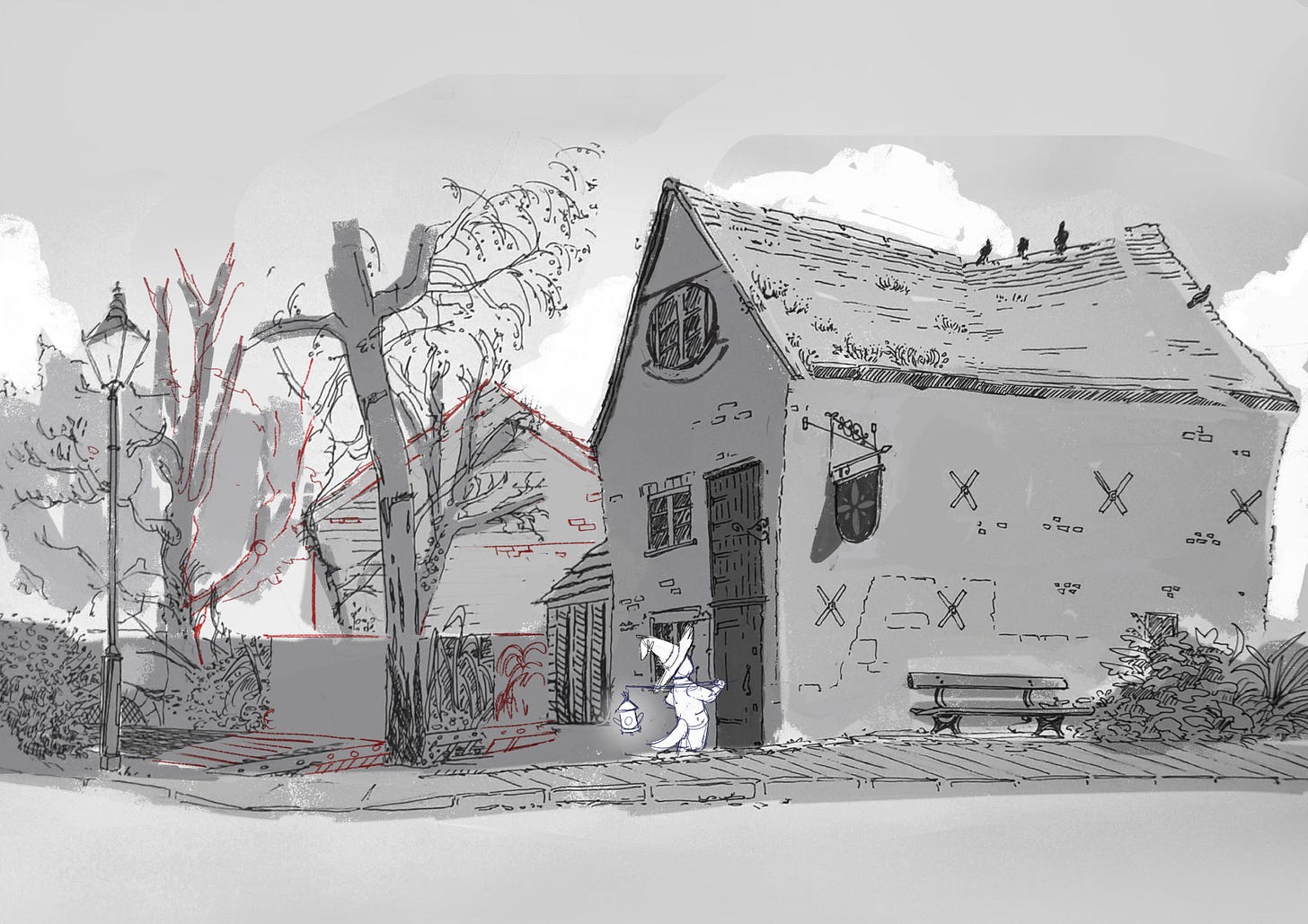
It was quite loose and with a limited time frame I am very happy with what I did in 2 hours. But as soon as I finished it, an idea came to me. What if I made a version with our friend Mago standing by those big old doors? And for two months it’s been sitting in my mind, poking my frontopolar cortex (The creativity bit, according to google).
Problem 2 - Illustration Style.
I have previously explored my style in this Alpha Painting article. And I pretty much nailed the characters there, but I still wanted to explore what they would look like in a landscape, and even what that landscape would look like.
I wanted to push the drawing away from the real thing and started by stylizing the roof to have a pretty pronounced bend, change a window here, and a tree there, and it starts feeling a lot more in line with the world I imagined. The next step is to print this and redraw the whole thing in watercolour paper.
Here you can tell what I meant earlier about the blank character, whereas the background is painted in values of grey, any characters will have a fully white silhouette.
Problem 3 - Digital or Traditional
At this point I already know I can do a pretty good job as a digital painter, but there is something organic about ink where the imperfections elevate the final result, a quality that I find doesn’t come naturally in a digital medium. So I was really under pressure to produce here, since I’m competing against my previous work.
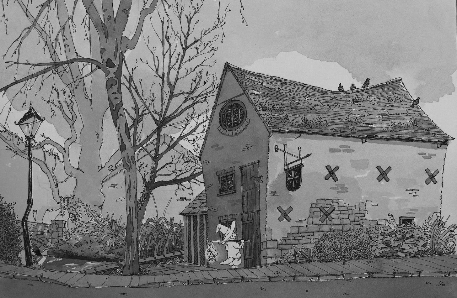
At this stage I finished stylizing some of the elements in the picture like the lamp post and vegetation, and the ink looks amazing, I was playing with a couple of techniques that really paid off. Wait, can you not tell it looks fantastic? Good! That is partly because it still needs to be properly photographed, which takes us to the next problem. And if it goes well, I am all in on the traditional art route, I really do enjoy the process.
Problem 4 - Photography
I am fortunate to have access to my brother's old work camera, a Canon 80D, and after requisitioning a tripod, I put this little setup together. You can tell it’s professional because I’m using a bag of lentils as a counterweight.
And after fiddling with a lot of settings I know painfully little about, I got to this image below. If you have the opportunity to see it in full screen and appreciate the details, please do.
Compared to my past attempts, the clarity and sharpness are on a different level, it is so reassuring to be able to achieve this level of fidelity with the photography process, I was so nervous after having failed before as I wrote in the “Making 18 portraits in a week!” Article.
And now what?
Well, first I am framing the original. I actually really wanted to do this so I could hang it in my son’s room who is soon turning 1.
I never hanged something I painted before and I thought it would be really sappy to make the first one for him.
And then I did something for you.
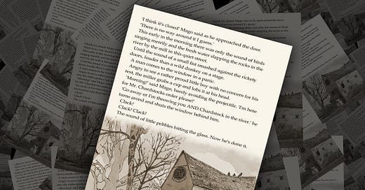
The text is not part of the actual script even though the setting and characters are a part of the books to be, but I put this mock-up together so we can all appreciate it coming together.
This really feels like my first page of what I hope to be many many more, so if you made it this far down, thank you so much. This one was very important to me, as I was hanging the picture I even said out loud “It feels like I made Art with a capital ‘A’ for the first time ”.
And could not be happier with how the mock-up turned out, really shows the way my career as a painter and writer are starting to weave together, and that is really exciting. Let’s see where we go from here!
To you, from the home of magic.
Marco D Blanco.


This is wonderful. When I saw the mockup of the text with the image I sat up in my chair and said "yes!"
I love seeing works in progress sort of posts. The picture that you did from the original is wonderful!